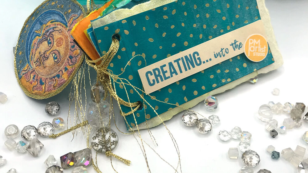
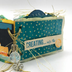
CREATING into the PM | Mini Artist Book
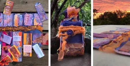
Mariah Rushing2023-03-01T05:17:34-05:00So P and I started a mini journal challenge… P has already taken a detour, she could not be contained within the miniature stage of a business card (3.5×2″). Her cards/pages now have turned into tags and little inserts and other tidbits. But not to worry, stay tuned we are going to work on getting pages done for all of those… soon!
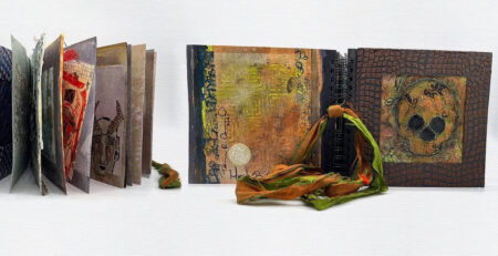
THE COVER
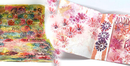
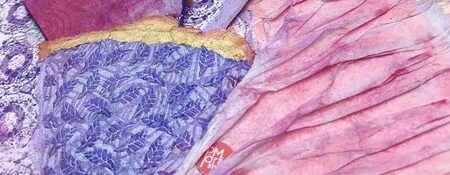
P helped me with the title after I submitted a few (much longer versions) across the table. I determined that my color scheme of blues, teals, oranges and yellows would be repeated throughout so I went with a dark teal for the cover. During card making, I have discovered alcohol ink markers work really well at altering the color on foil embossed papers. This same technique was used on many of the pages throughout the journal. When the color still wasn’t spot on, I used a little bit of shimmer spray, not fully shaken to bring it home. The title bar was printed (version 5, finally got the scale and color right), then attached with foam with the PM logo glued on separately.
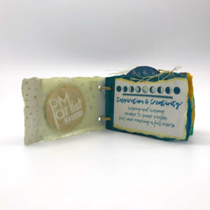
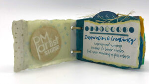
INSIDE COVER | LUNAR PHASES – INSPIRATION & CREATIVITY
As with most things I create, the PM logo is going to be represented because it has so many levels of meaning and emotion connected to it. P is for Patricia and the M for me (Mariah)… it also signifies the time of day when we work on most things, PM in the p.m. The design is something I am also very proud of as a graphic designer. Art, in all its forms and fancies, is a passion for both us so when you see our PM logo, know it is put there with love.
There were 3 or 4 other options I tried before settling on this simple, graphic representation of changes that occur in the cycle of creativity. I wrote the saying below as a way to initiate the idea for the message of the entire journal:
“Waxing and Waning, similar to lunar phases, but never reaching a full eclipse.”
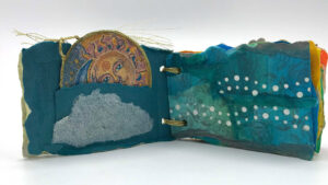
SUN AND MOON MEDALLION | WAVY HOLES
I had planned on more tags than this but it just turned out that this became the only pocket and “tag medallion” with two sides: the back side with a quote from C. JoyBell C.:
“The dance between darkness and light will always remain — the stars and the moon will always need the darkness to be seen, the darkness will just not be worth having without the moon and the stars.”
On the opposite page, a Moon and Sun graphic once again reiterating the theme. The moon is bordered with gold embroidery thread, tied with knots and fastened between the sides to create a lovely little handle. A bonus (lovely accident:) was the end of the thread was left poking out of the one side like rays from the sun! The pocket is meant to blend into the background so the medallion can be tucked behind the cloud allowing the sun to peek out.
One of the left overs I had from another project, was destined for this Medallion page in this journal! The paper started out as one of our printed patterns, then colored with alcohol ink markers and punched with the wavy border punch. One strip became the page by tearing, then using the markers to blend the pieces together.
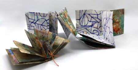
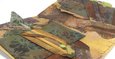
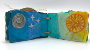
MOON & SUN MIDDLE PAGES
We are now at the beginning that became the middle. The moon page was created with a left over thread swirl circle from one of our cards. Using a deco pen and some new shimmer spray, a moon was made. This same shimmer spray was used in three stenciled stars from yet another project. Funny thing is the moon and the stars started out as yellow/gold; if you look closely, little hints of that shine through. Being such a small size, the journal photographs beautifully with these little whispers of gold twinkling through winking a reminder of their beginnings.
Whispers of Vincent van Gogh wind swirls are embossed on a color-gradient background gently rolling around and into the sun. The sun was adapted for use here with a bit of added color to pump up the yellows warming up the page as you pass to the next.
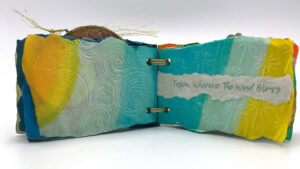
DANDELIONS
The breeze now turns to the backside to reveal embossed dandelion seeds blowing up, up and away “Taken, Wherever the Wind Blows”. This statement floating above the wind propelled dandelions continues on to the next page where color repetition keeps the movement, rhythm and focus on the central theme.
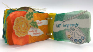
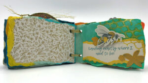
THE BEE
Dandelion seeds become elegant, gold-foiled flowers embossed upon paper leading into the next statement: “Landing exactly where I need to be!”. A bee and flowers visually reinforcing that theme. Sprays, stamps and fussy cutting were used to create the elements on the page.
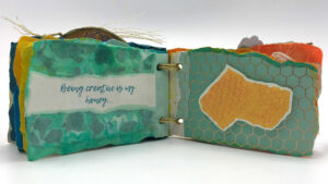
CREATIVE HONEY
Taking the bee imagery along to the next page, “Being creative is my honey…” expands the metaphor even further; honey is the impetus for the bee as creativity is for mine. Visuals, graphics and papers direct the viewer back to the statement. Torn pieces of paper remnants are glued on the background of the statement page . On the opposite page, a slice of honeycomb floats above foil patterned paper with the same motif.
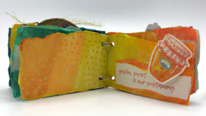
GOLDEN SWEET
Honey pours onto the next pages in warm amber hues of oranges and yellow that prompt our sensory memories of the smell and taste of honey. The same foil paper from the cover was used here colored in the same amber hues spilling onto the opposite page in an orange to yellow gradient. The honey jar holds the nectar “…ever sustaining”, the essence of creativity.
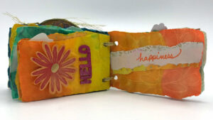
HELLO HAPPINESS
Surely it would be a HELLO to happiness putting all that creativeness in a jar then taking it out in spoonfuls when the need arises. Just imagining that idea brings me happiness! So, all that’s required (for me and the bee) is sunshine and flowers!
BLOSSOM ART
Color, theme and repetition finish up my lovely little mini-journal. “Where creativity blossoms… ART happens!” is what this entire journal is about so going out with blossoms, color, foil, embellishments (and of course our PM logo) is totally fitting.
THE BINDING AND DANGLING CHARMS
It’s not perfect, but that is ok… the gold binding thread is actually 2.0, the first being a black wax thread that was much too rustic. I had already used the gold on the medallion and should have known it was right for the binding as well. Since this is my very first from scratch journal I know it may be amateurish, again I am ok with that. The three glass beads are from P’s stash (actually one was from a necklace she made me) I knew would be perfect, just had to hunt them down. The first two went on like butter, the third – the one from the necklace had to be threaded strand by strand.
Now it is complete, the end, la fin!