04Aug
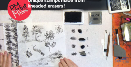
The stamp in this video is a small, unassuming little slice (and we aren't just talking about a surprise but... read more
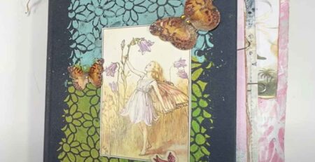
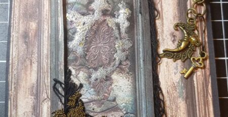
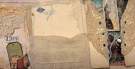
The June Makers Collaboration theme, Old Is New, presents Quirky Queens Journals using three art items from... read more
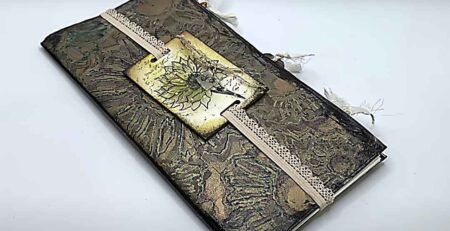
The June Makers Collaboration theme, Old Is New, presents Two Old Crows Mixed Media using three art... read more
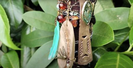
The June Makers Collaboration theme, Old Is New, presents Ceri Griffiths using three art items from read more
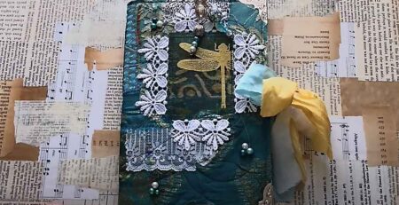
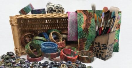
The June Makers Collaboration theme, Old Is New, presents TextureJunkies using three art items from read more
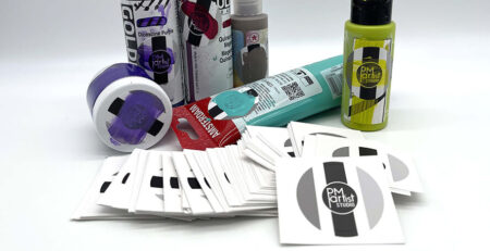
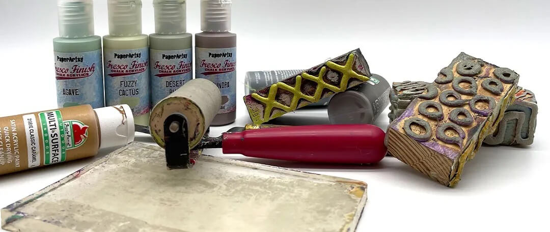
One of the factors in successful printing or painting is knowing the opacity of the color being used. This can... read more
The June Makers Collaboration theme, Old Is New, presents Martha-SeekingforArt using three art items from read more
The June Makers Collaboration theme, Old Is New, presents The Messy Palette AU using three art items... read more
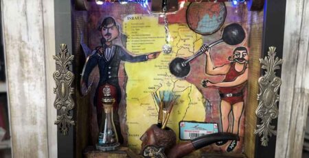
The June Makers Collaboration theme, Old Is New, presents Artsy Solutions using three art items from read more